🎨 Matplotlib Figure and Axes
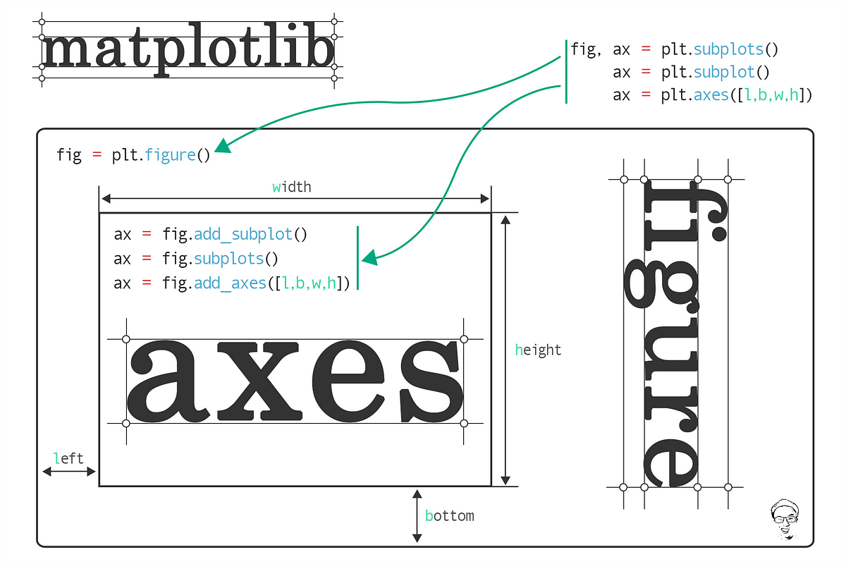
When working with Matplotlib or visualizations in general, it's helpful to understand the terms "figure" and "axes". Here's a simplified explanation:
Figure: Think of a "figure" as a blank canvas or an empty window where you can place your plots. It's the whole area or background on which everything is drawn. A figure can contain one or more plots (or "axes").
Axes: The term "axes" can be a bit misleading because it's not just the x and y-axis lines you might be thinking of. Instead, in Matplotlib, "axes" refers to an individual plot or graph that's placed on the figure. This includes the x-axis, y-axis, the lines, points, labels, ticks, and everything that makes up that specific plot.
In essence, when you're making a graph, you start with a figure (your blank canvas), and then you add axes (your actual plots or graphs) to that figure.
To give a real-world analogy:
- Figure: Imagine you have a blank sheet of drawing paper.
- Axes: Now, on that paper, you draw a graph with its grid, labels, data points, etc. This entire graph is the "axes".
So, if you were to create a page with multiple graphs, the whole page is your figure, and each individual graph on it is an axes.

Matplotlib's subplot, subplots, and gridspec functionalities offer a powerful way to create multiple axes (plots) within a single figure. The more advanced AxesGrid toolkit is also an option but might be overkill for many applications.
Here's a tutorial on how to create multiple axes using Matplotlib:
1. Installing and importing Matplotlib
To install Matplotlib, run the following command in your terminal:
pip install matplotlib
poetry add matplotlib
To import Matplotlib, run the following code:
import matplotlib.pyplot as plt
2. Basic Subplots using subplot
The plt.subplot() method allows you to position a new plot in a grid of plots. The method arguments are the number of rows and columns in the grid, and the index of the current plot, respectively.
import numpy as np


x = np.linspace(0, 10, 100)

# First subplot (top)
ax_0 = plt.subplot(2, 1, 1)  # 2 rows, 1 column, index 1
ax_0.plot(x, np.sin(x))
ax_0.set_title("sin(x)")

# Second subplot (bottom)
ax_1 = plt.subplot(2, 1, 2)  # 2 rows, 1 column, index 2
ax_1.plot(x, np.cos(x))
ax_1.set_title("cos(x)")

plt.tight_layout()  # Adjusts subplot spacing
plt.show()
3. Using subplots for More Control
The plt.subplots() method (with an 's' at the end) is more versatile. It creates a figure and a grid of subplots in one go, returning the figure and an array of Axes objects.
fig, axes = plt.subplots(2, 2)  # 2 rows, 2 columns

# Access each subplot via the axes object
axes[0, 0].plot(x, np.sin(x))
axes[0, 0].set_title("sin(x)")

axes[0, 1].plot(x, np.cos(x))
axes[0, 1].set_title("cos(x)")

axes[1, 0].plot(x, x)
axes[1, 0].set_title("Linear")

axes[1, 1].plot(x, x**2)
axes[1, 1].set_title("Quadratic")

plt.tight_layout()
plt.show()
4. Complex Grid Layouts with gridspec
For non-uniform plots, the GridSpec class allows for customizable layouts.
from matplotlib import gridspec

fig = plt.figure()

# Define the grid layout
gs = gridspec.GridSpec(2, 2, width_ratios=[1, 2], height_ratios=[2, 1])

ax0 = fig.add_subplot(gs[0])  # Top left
ax0.plot(x, np.sin(x))

ax1 = fig.add_subplot(gs[1])  # Top right
ax1.plot(x, np.cos(x))

ax2 = fig.add_subplot(gs[2])  # Bottom left
ax2.plot(x, x)

ax3 = fig.add_subplot(gs[3])  # Bottom right
ax3.plot(x, x**2)

plt.tight_layout()
plt.show()
Tips:
Using
fig.tight_layout()orplt.tight_layout()helps to adjust subplot spacing to minimize overlap and make the presentation neater.Each subplot is its own
Axesobject, which means you can set properties like title, x/y-label, ticks, and more individually.If you're frequently making multi-plot figures, consider using libraries like
Seabornthat make certain complex plotting tasks more straightforward.
Further Resources:
The Matplotlib official documentation is an excellent resource.
For more advanced subplot arrangements, check out the AxesGrid toolkit.
Remember, like any skill, mastering Matplotlib's multi-axes features takes practice. As you work with it more, you'll find ways to effectively visualize your data across multiple plots.